Data & Infographic Visuals
Clarity, data-driven aesthetics, and translating abstract numbers into high-end, scannable visual narratives.
10 promptsTips Before You Start
Before copying and pasting these prompts into your AI image generation tool, make sure to select the correct image generation mode or style setting in the tool. Keep in mind that you may need to iterate a couple of times to achieve your desired outcome, AI generation often improves with slight prompt adjustments.
Prompt Template
A clean 3D animation of a bar chart on a [Background Color] surface. The bars rise one-by-one with a glowing [Accent Color] line tracing the growth path.
Example
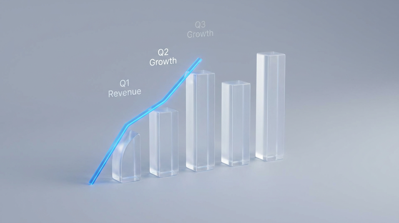
A 3D bar chart on a soft-grey surface. The bars rise as a glowing electric-blue line traces the path.
Try this prompt
Prompt Template
A minimalist layout showing three circles representing [Step 1], [Step 2], and [Step 3]. A glowing 'data stream' line pulses between them to show a seamless transition.
Example

Three frosted-glass circles for "Input," "Analysis," and "Result." A pulsing white line connects them.
Try this prompt
Prompt Template
A solid [Brand Color] screen. In the center, a large digital counter rapidly rolls up to [Final Number]. A caption below reads: '[Impact Statement]'.
Example

A deep-navy screen with a counter rolling up to "1.2 Million." Caption: "Active Users."
Try this prompt
Prompt Template
A dark stylized world map background. Three glowing 'hotspots' appear over [Region 1], [Region 2], and [Region 3]. Thin arcs of light connect the regions.
Example

A dark map with hotspots over London, Singapore, and NYC connected by arcs of light.
Try this prompt
Prompt Template
Two side-by-side donut charts. Chart A represents [Variable A] and Chart B represents [Variable B]. The segments animate in a circular motion.
Example
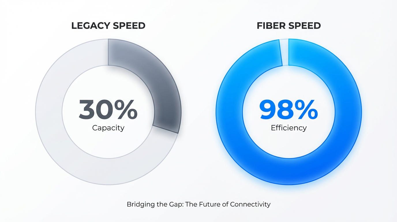
Two donut charts comparing "Old Speed" (30%) vs. "New Speed" (98%).
Try this prompt
Prompt Template
A 3D isometric view of three stacked glass panes. Each pane represents: [Bottom Layer], [Middle Layer], and [Top Layer]. Labels float to the side.
Example

Three glass panes for "Database," "API," and "UI" with floating labels.
Try this prompt
Prompt Template
A semi-circular gauge with a needle. The needle moves from a red [Problem Zone] to a green [Success Zone] as the product logo appears.
Example

A gauge needle moving from "High Risk" to "Fully Protected" as a shield icon appears.
Try this prompt
Prompt Template
A 3D glass pyramid divided into three sections. Each section glows as the camera pans down, revealing: [Top Tier], [Middle Tier], and [Base Tier].
Example

A glass pyramid glowing as it shows "Strategy," "Management," and "Operations."
Try this prompt
Prompt Template
A dark 'Command Center' aesthetic. A heartbeat-style line graph pulses. Every 2 seconds, a data point pops up with the text: '[Live Metric Name]'.
Example

A dark screen with a green pulse graph and a popup saying "99.9% Uptime."
Try this prompt
Prompt Template
A central product icon surrounded by four smaller icons. Thin lines connect the center to the outer icons: [Metric 1, 2, 3, and 4].
Example

A smartphone icon connected to icons for "Battery," "Camera," "Security," and "Speed."
Try this prompt
Ready to Create Stunning Visuals?
Stop scrolling. Start generating. Turn any of these prompts into professional visuals with PlayPlay Design — no design skills required.