If you want your brand to stand out, static ads might not cut it anymore. Creating motion graphics will bring your marketing to life with eye-catching animations that grab attention faster and hold it longer.
Unlike still images, they add movement and offer endless creative flexibility, letting you experiment with colors, transitions, and dynamic effects to match your brand’s vibe.
If you're considering motion graphics for your ads, you’re probably looking for some inspiration. That’s exactly what this article is here for. We’ll share standout motion graphics examples to spark inspiration for your marketing and encourage you to create your own!
10 awesome motion graphics examples for your company
Here are ten of the best motion graphics examples we've seen to help you create your video and strengthen your brand marketing efforts.
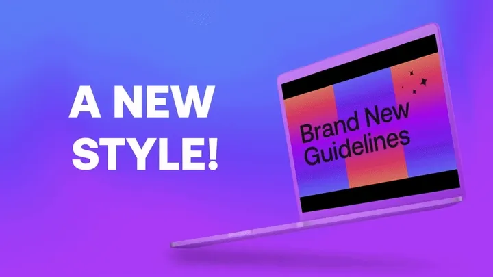
1. Wise Design intro
Industry: Financial services
First on our list of examples is this color-fest from Wise. The first thing that gets your attention is their opening question (which serves as the hook here), all the bright brand colors, and the fast-paced music.
We love the pacing of the messaging, which is quick, digestible, and revolves around the company’s new design and goals.
Why it works so well:
The arrangement and transition from one still image to the other tell a story — without the need for voiceovers. Just short blocks of text that are easy to follow.
The music is attention-grabbing but doesn't distract from the scenes on our screen.
It shows off the Wise brand generously — from the logo and colors to how the brand interacts with its audience. Any time a brand does a rebrand, we love to see a video to show all its new elements working together!
2. Slack “Work Simplified” video
Industry: Business communication
This video shows what life without and with Slack might look and feel like for a worker.
Before Slack, we see the main character struggling to keep up with their workday. They are drowning in emails, eventually missing important information. Once they switch to Slack, everything changes. The pace slows down, the character is visibly relaxed and even happy, and everything becomes more colorful.
What stands out for us is how Slack captures its product’s core value with visual elements and no dialogue. The video gives off a similar feeling as if you were watching humans struggle with their workday.
Why it works so well:
Even though it's animated, it feels realistic and does a great job of visualizing real-life struggles.
The story and visual transitions are perfectly synced. For example, the video becomes more colorful with upbeat music once the character switches to Slack. It’s also important to note that the colors used are Slack’s brand colors.
It relies entirely on visuals and clever sound design for effective communication.
3. Dropbox product reintroduction video
Industry: Software development
This video addresses the long-held belief that Dropbox is solely for document storage and protection. While that’s the main use case, Dropbox wants its public to know it can do much more than that.
What we love about this video is that it nudges you to start thinking, “What else can I do with Dropbox?”
Also worth noting is the show-and-tell approach. It doesn’t just tell its public about the new things Dropbox can do; it shows them how it works in the real app, but uses motion graphics to make it all the more interesting (they even made signing a digital contract exciting to look at!). At the end of the video, one may be likely to log into Dropbox to explore these features themselves!
Why it works so well:
The narrator’s voice is soft, welcoming, and not too serious — almost like you’re chatting with a friend.
The video is well-paced and gives viewers time to digest the information shared before moving on to the next diverse use case.
Even though it’s a sales video, it doesn’t feel like a pitch. Instead, it softly encourages viewers to explore Dropbox’s different features.
4. Coinbase Commerce intro video
Industry: Cryptocurrency
Sometimes, all you need to create are simple transitions, the right text, and a clear voiceover to get the job done.
That’s what Coinbase does in this product announcement video. What we like best is that the ad doesn’t feel overwhelming. From the music to the visual setup, everything is well-placed and timed. It’s a highly educational and straightforward video. No frills, because it really doesn’t need any.
Why it works so well:
Knowing that crypto is a complex subject, it uses voiceovers and text-on-screen to make it easier for the audience to understand the ad’s core purpose.
It smoothly transitions to showcasing the app. Keeping the animation separate ensures the audience can fully absorb the key point without distraction.
The animation is eye-catching yet doesn’t overwhelm viewers. It shows just what we need to see, and is great for its audience (merchants).
5. Mastercard “Passkeys” Explainer video
Industry: Financial services
When you’re creating a motion graphics video to explain a financial service or feature, you have to be extra careful. Often, the talking points revolve around sensitive topics (financial security, check out safety, etc.), so the timing needs to be just right so people don’t miss key details, and the style or visuals have to be clear enough to avoid confusion and maintain trust.
That’s what Mastercard does here. The video is well-paced and the information is delivered clearly through inviting visuals. The style of the graphics, music, and voiceover complement what is shared and do not overshadow or distract from the core information.
Why it works so well:
It uses illustrations and animation that don’t overwhelm viewers. For example, the illustrations and text are set against a white background, so they easily stand out.
The narration is well-paced and aligns with animation — making it easier to follow along, especially through some of the more complex definitions and services.
The video starts with a common challenge — fraud — helping to draw them in and capture attention quickly.
6. inDrive short ad
Industry: Transportation and Ride-Hailing services
This ad proves you don’t need a big budget or a long runtime to effectively communicate. With a sharp concept, brilliant visuals, and a clear takeaway, you can do this effectively.
In just six seconds, inDrive nails its message: it’s the more affordable choice for ride-hailing. The ad keeps things simple but effective, using just a few visuals to make its point.
Right on the screen, you see two dollar signs — one bold and highlighter-green, representing inDrive, and another smaller, gray one underneath, likely referencing a major competitor. The implication is clear: inDrive helps you save money compared to other ride-hailing options. No further context is provided besides a car on the screen, which piques curiosity.
Why it works so well:
Money talks. There’s no need for flashy visuals or complicated storytelling. The ad makes its point instantly with just two symbols and a clean design.
It stays true to inDrive’s brand and aligns with what inDrive stands for: addressing mobility issues and increasing access to reliable, affordable transportation. Here, it focuses on the financial burden, which is always an attention-grabber.
It subtly calls out the competition. Without being aggressive or naming names, the gray dollar sign seems like a nod to Uber, a leading player in the space. It’s a clever way to highlight inDrive’s pricing advantage without stirring the pot
7. Burger King Rebrand video
Industry: Food and Hospitality
Burger King’s rebrand video is a vibrant, high-energy showcase of its refreshed identity. From the first frame, the video grabs attention with bold, playful motion graphics that seamlessly introduce the new logo, typeface, packaging, and overall design system.
The animation flows smoothly, with dynamic transitions that keep the style and visuals engaging while reinforcing the brand’s personality — modern yet nostalgic, fun yet premium. Not to mention, we got pretty hungry after watching this animation!
Why it works so well:
This animation uses so many clever motion designs and transitions. Every cut, fade, and morph feels fluid, making the video feel effortless to watch. There’s never a dull moment. One of our favorite parts of this animation is how they stretch out the word “drool” to essentially perform the verb it describes.
Typography is an essential part of the video’s visual element. The playful use of text isn’t just informative; it’s part of the motion design, bouncing and shifting in sync with the beat. It makes the fast food restaurant look like the next best place to have a good time.
The video perfectly reflects the rebrand’s earthy, vintage-inspired aesthetic without feeling outdated. It also shows off more about its efforts, such as having plant-based options, or more emphasis on greens.
8. Google - “Welcome to the Gemini era” video
Industry: Technology
It’s no surprise that Google has made this list. Tech and software companies have a lot to take advantage of when it comes to motion graphics because this type of content allows them to show their product in action in a much more compelling way than a screen recording.
Google opted to introduce its Gemini AI technology through a series of live-action shots combined with dynamic, exciting motion design. The editing is clever, the video never stops its motion, and the music brings it all together. It’s a great way to show off all of the capabilities of the Gemini technology.
Why it works so well:
The video starts off with an iconic music line, which suggests something revolutionary is about to be shared, and builds up excitement for the release.
The combination of the live-action shots of real people using the technology and the motion graphics to show the tools in action make for an effective display of the helpful relationship between AI and everyday people like us.
The swift movements of the Gemini sparkle icon throughout the video also pays homage to its modern, up-to-date feel. The tool is ready to work, and we feel it with the pacing of the graphics from the beginning of the video until the end.
9. Intel brand transformation video
Industry: Semiconductor manufacturing
Now, we had to squeeze one more rebrand video in here because it’s such a great way to show off how much a brand has transformed. Intel’s rebrand video is funky, bright, and modern, and reflects the brand’s technological background and lasting presence.
Why it works so well:
We love it when form equals function in motion design, so the first 10 seconds show a live-action shot that’s small and dropped as the words “do something small” appear, to then expand that same shot to take up most of the screen with the word “big” on it is very impactful. A great, inspiring way to kick off Intel’s new brand video!
The motion graphics of the text animations pace with the rhythm of the upbeat pop music playing, encouraging viewers to keep watching. There’s always something satisfying when shots match music so well!
The motion graphics are smartly composed on the screen, going from an image on the left, then shifting them to the right, and then the centerThis may seem small, but it actually helps viewers stay engaged because each new moment in the video truly feels like a different experience and not static.
10. Netflix 25th anniversary video
Industry: Video streaming services
If you ever wondered about Netflix’s backstory, this video is the one to go to. The use of motion graphics in this video is more subtle and used sparingly since it’s the Netflix shows and movie shots that take the cake for attention. Regardless, the motion graphics help carve out the story to show off a bit more of the Netflix product itself.
Why it works so well:
The video uses Netflix’s signature red brand color with their animated texts and symbols to push the story along. The first instance is with the “25 years ago” voice-over moment when a 25 is shown on the screen moving in a reverse-clockwise direction to show we’re going in the past. A great use of storytelling to keep us in for the story.
The voiceover itself is well done. The voice actor is strong, charismatic, and overall a good storyteller who knows when to emphasize certain words to make Netflix shine.
Brief moments of motion graphics are used to nod to the nature of Netflix being a steaming application without being too in-your-face or explanatory about using the product itself.
What are the types of motion graphics?
There’s more than one way to use motion graphics for video marketing. Here are a few examples worth exploring for your animated ads.
3D Motion Graphics
Advanced animations using 3D elements for a more immersive and dynamic visual experience, often seen in commercials and films today.
2D Motion Graphics
Flat, two-dimensional animations using text, icons, and illustrations. Common in explainer videos, ads, and social media content.
Kinetic Typography
Moving text animations that highlight key messages — often used in advertisements, explainer videos, and presentations.
Logo Animations
Animated brand logos used in brand intros, outros, and promotional materials for a polished, more professional look.
Infographic Animations
Animated charts, graphs, and data visualizations that make statistics easier to understand (or more interesting to look at!).
UI/UX Animations
Motion effects based on visuals from apps and websites, such as button transitions, loading screens, and smooth scrolling.
Title Sequences
Dynamic animated text and visuals for movie, documentary, and TV show intros, setting the theme and mood for the story.
Broadcast Graphics
On-screen graphics for TV and live broadcasts, such as lower thirds, news tickers, and sports scoreboards.
The cool thing is that you can combine multiple motion graphics options in a single video. There’s no reason to limit your creativity or inspiration.
What are the benefits of motion graphics videos?
Here are some examples of why it is worth investing in motion graphics videos for better brand marketing.
1. It makes it easier to communicate complex ideas
They simplify complex ideas by turning abstract concepts into clear, engaging visuals. Instead of relying on dense text or static images, they use animation, icons, and transitions to break complicated subjects into digestible pieces.
For example, in finance, explaining how compound interest works with just words can be overwhelming. But with motion graphics and animation, you can animate money growing over time, visually demonstrating the concept in seconds.
Similarly, if you're introducing a new banking feature, you can show a step-by-step animation of how users interact with it, making it more intuitive and easier to understand with this type of animation.
2. It improves your creativity
They let you break free from the usual and turn abstract ideas into something people can actually see and connect with.
You can move objects, turn boring charts into dynamic visuals, or even make a credit card talk. You’re not stuck with static images or walls of text. Instead, you can mix animation, text, and illustrations to bring ideas to life in a way that grabs attention.
Say you want to explain something like market trends. Instead of just showing a plain old bar graph, you can animate the market rising and falling in a way that actually makes sense to people.
3. It cuts down on live-action video logistics
One of the biggest advantages of motion graphics is that everything happens in a virtual world — no need to book locations, hire actors, or worry about lighting and weather.
You can create entire scenes, characters, and effects without ever stepping foot on a set. Want to showcase a futuristic city? No need to scout locations; you can build it digitally. Need to explain a product feature? No actors required; just animate it.
This makes motion graphics more flexible and potentially cost-effective than live-action video. You’re not dealing with scheduling conflicts, travel costs, or reshoots.
Motion graphics best practices
The following best practices will help you create motion graphics videos with animations that effectively capture attention and deliver the message.
Don’t overload with too many effects; clarity is key.
Use smooth transitions and avoid jarring cuts that are distracting.
Use large, legible fonts and limit on-screen text — no one wants to read too much when watching this kind of video.
Match the style to the message. Use the right colors, fonts, and motion to fit your brand tone and overall video vibe.
Don’t rush or drag animations; the pacing should match the content’s energy.
Create engaging motion graphics videos with PlayPlay
You don't need complex software to make studio-quality motion graphics videos. With PlayPlay’s animated video maker, you can achieve this in a few minutes.
The best part is you don't need to start from scratch. Our online video creation and editing tool has a library with numerous customizable templates that include a variety of simple yet professional-quality motion graphics. All you need to do is choose what fits your idea, customize it per your overall goal, and your video will be set for your marketing channels in minutes.
Want a more hands-on approach? Try our AI Video Generator or start from a blank screen in our software. We also provide drag-and-drop features to speed up your creating process!
We’ve answered common questions about this type of video marketing.
Motion graphics FAQs
What is a motion graphics video?
Motion graphics are animated videos that use non-static elements to capture and communicate a brand’s message. They often feature smooth transitions, kinetic typography (moving text), and engaging visuals to make information easier to digest and more appealing.
You can create professional motion graphics videos using PlayPlay’s video maker and editor.
What is the difference between graphic design and motion graphics?
The main difference between graphics design and motion graphics is movement. Graphic design is static—think logos, posters, and social media graphics. It’s all about arranging visuals, text, and colors!
Motion graphics, on the other hand, bring graphic design to life with animation. It adds movement to text, shapes, and images to make videos more dynamic and engaging.
What is an example of motion graphics?
A common example of motion graphics is an explainer-type video, which a company tends to use for introducing a product or service. These videos usually feature animated text, icons, and graphics to make complex ideas easier to understand. Other examples include animated infographics, such as moving charts and diagrams.
How much does a motion graphics explainer video cost?
A motion graphics explainer video costs around $2,000-$3,500 per minute of video duration. The exact price depends heavily on factors like complexity, length, and turnaround time. You can also make these videos for a more affordable price using PlayPlay.
How long does it take to make a motion graphics video?
A simple motion graphics video with basic text, icons, and smooth transitions can take a few days to a week. Creating more complex videos with custom illustrations, advanced animations, and special effects can take weeks or even months.
Don’t want to spend that much time or start from scratch? With PlayPlay, you can create professional motion videos in minutes using 300+ ready-made motion graphics templates — just customize them to fit your brand, and you’re good to go.